响应式布局

logo.jpg

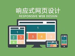
一套代码如何在多种设备下完美显示?你得玩玩响应式布局。

设置meta:vp

1
<meta name="viewport" content="width=device-width, user-scalable=no, initial-scale=1.0, maximum-scale=1.0, minimum-scale=1.0">

媒体查询

设置完meta:vp后,接下来设置媒体查询

link标签的 media 属性

1
2
3
<link rel="stylesheet" href="print.css" media="print"> 打印
<link rel="stylesheet" href="desktop.css" media="screen and (min-width:500px)"> 大于500px时生效
<link rel="stylesheet" href="mobile.css" media="screen and (max-width:500px)"> 小于500px时生效

css文件中使用 @media

1
2
3
4
5
6
7
8
9
10
11
.box{
background-color: red;
color:blue;
}
@media (max-width:320px){
.box{
background-color: green;
color:orange;
}
}

【点击查看在线演示】

利用checkbox的:checked伪类,实现点击切换状态

点击checkbox后,h1的字体变红:

1
2
3
#checkbox:checked ~ h1{
color:red;
}

【点击查看在线演示】

使用label美化,添加按钮图标

1
2
<label for="menu-checkbox">点击菜单</label>
<input id="menu-checkbox" type="checkbox">

【点击查看在线演示】

-------------本文结束感谢您的阅读-------------